


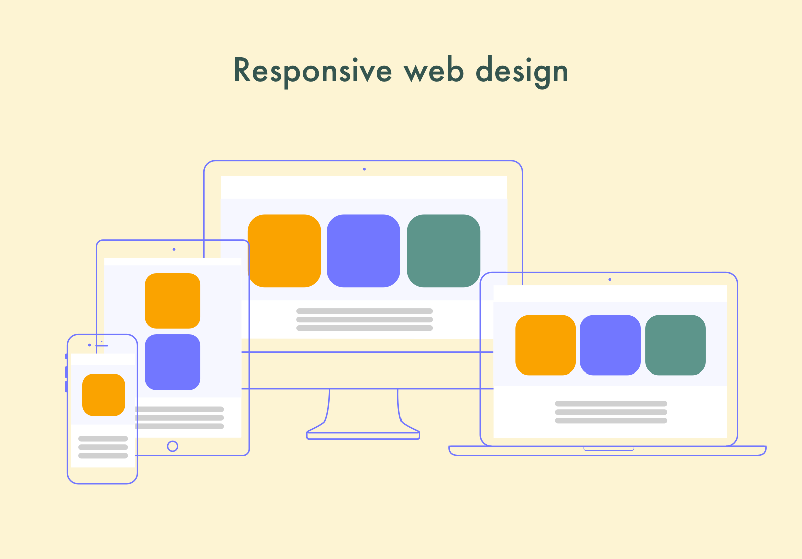
Making a good website or web app is crucial for effective business promotion. But, taking into consideration the growing number of mobile Internet users, it’s equally important to make this website responsive, i.e. automatically adapting to various screens. In this guide, we’ll figure out the benefits of responsive website design and compare it with a full-fledged mobile app. Also, we’ll tell how to create web design of a responsive site.

Do I Need a Responsive Web Design or a Mobile App?
No matter whether you already have a website or just going to create one, you want it to be mobile-friendly. Essentially, there are two ways to do it: by making a responsive web-design or developing a mobile app. Each approach has certain benefits. Depending on your goals, you may choose one option or another (or both).
The Benefits of a Mobile App
While the mobile app development cost is usually higher, it can be a preferred solution in the following situations.
- You are going to offer proprietary or very specific services or goods and want your brand to live in the customers’ memory. A separate app icon on the screen will remind them of you more frequently.
- You need to provide offline access to your services, along with online. A mobile app will cope with this task, unlike a website, even if the latter has a good responsive design.
- An app serves as an add-on. This is a common practice: a website contains detailed information about the company, its goods and services, blogs, expert tips, and so on. An app, in turn, helps to receive these goods and services in a couple of clicks. The two co-existing products supplement each other.
- Smartphone native functionality is used. If one needs integration with the phone features (contacts, camera, GPS, Wi-Fi) to use the product, it makes sense to offer it in the form of an application. One of the shining examples is Instagram, which has a web-version, but it is just an add-on.
- Your product is an online store or a game. While both options can be used in a mobile browser, a dedicated app is way more convenient.
Finally, a mobile app can be of use when users need to deal with calculations or large volumes of data processing. An example is an investment calculator, which is more convenient to use in an app.
The Benefits of a Responsive Website
While a mobile app usually serves as an important add-on for a website and an effective tool for attracting customers, a website, in turn, is essential for brand promotion. Sometimes, it even makes no sense to make an app without having a site. To make your brand recognizable you need to start with a website first. Needless to say, the site must be compatible with different screens, i.e. responsive. Here are the key reasons to opt for a responsive site rather than an app.
- You need to promote your brand. When nobody knows about you, it makes sense to create and promote a website that contains comprehensive information about the brand. A mobile app, even the most powerful one, will hardly let you reach the same result. Once your brand is recognizable, you may come to the scene with an app.
- You have specific content to offer. Sometimes, there is simply no need for an app. For example, for a news web-portal or an e-mail service, a mobile application is unnecessary.
No matter whether you are going to develop an app or not, making your website responsive is an important task. Keep on reading to find how to do it most effectively.
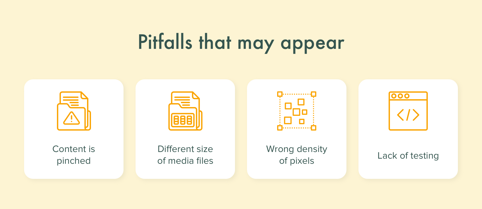
Common Pitfalls to Avoid When Developing a Responsive Website
Developers engaged in creating a responsive design face some challenges that can’t be ignored. The main things to consider are the following.
- Important and unimportant elements. When making a mobile version, you need to rearrange the content. To prevent cluttering, unnecessary elements are often hidden or removed.
- Large media files. Faster loading is one of the main reasons why users opt for a mobile version of the site. Large images and videos can slow it down severely, so consider the possibility of their downscaling.
- Pixel density. This problem is related to the previous one. A good responsive website must look equally great on different screens.
- Need for testing. Before launching a mobile version, you’ll need to test all variations of screens possible. If you don’t have so many devices, you may use emulators.

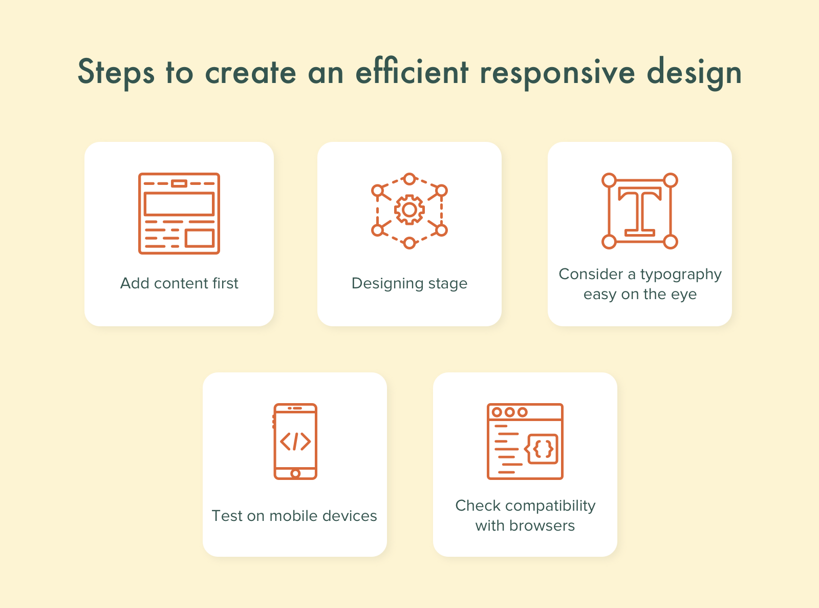
The Main Steps of Responsive Website Development
Responsive design development is a complex procedure. To make it as fast and efficient as possible, one needs to use a correct step-by-step approach.
- Content writing. A common mistake is trying to adapt content for an existing web page, not vice-versa, which causes time losses and can result in faulty page design. The right approach is quite the opposite: write the content first and then draft a page for it.
- Designing a mockup. This is an essential step that can be subdivided into several smaller stages.
- Choosing fonts and think of navigation. The importance of this step can hardly be overestimated, as usability is everything.
- Verifying the design on a mobile screen. While developers make most of their work on computers, they need to double-check everything on various mobile screens just to make sure all the elements look as they are supposed to.
- Verifying the design in various web-browsers. You must make sure your site will work correctly in all browsers. Of course, this requires a lot of testing, but you shouldn’t skip this important step.
Once you’ve made sure both the content and design meet your requirements completely, you can proceed to development. If you’ve done good preparatory work, this stage should not cause any difficulties.

How Much Does a Responsive Design Development Cost?
As a general rule of thumb, nobody will ever tell you the final cost without knowing all the details. However, you can make rough calculations if you know the cost of the adaptive version of your website development. Approximately, it makes 30-50% of the time and money spent on the adaptive version of your project.


