



Key Takeaways
- Build the dashboard around real decisions instead of displaying every possible metric.
- Put cash flow, bills, spending, savings, and goals in order of urgency.
- Use charts to reveal patterns quickly, while keeping exact figures easy to find.
- Make data accuracy, privacy, accessibility, and plain language central design requirements.
- Connect every important metric to a useful next action.
A well-planned personal finance dashboard turns scattered balances, transactions, bills, and goals into a clearer picture of what needs attention. Its purpose is not to display every available number on a single screen. It is to help someone make a better decision before they spend, save, transfer money, or adjust a plan.
The strongest dashboards make financial information feel manageable. They show what is happening now, explain meaningful changes, and make the next step obvious. Whether the user is managing one checking account or several household accounts, clarity matters more than visual complexity.
Why Personal Finance Dashboards Need A Clear Purpose
Money data often lives in separate places, including banking apps, credit card accounts, loan portals, savings accounts, and spreadsheets. A dashboard should bring the important parts together and answer practical questions, such as: How much can I safely spend? What bills are due soon? Did spending rise this month? Am I still moving toward my goal?
That focus supports a broader view of financial health. The financial well-being framework recognizes that a person needs day-to-day control, resilience in the face of financial shocks, progress toward goals, and the freedom to make choices. A dashboard should support those outcomes, not simply report income or account balances.
Start With The User’s Most Important Money Questions
Begin by listing the decisions the dashboard must support. Someone checking before buying groceries needs a quick view of available cash and upcoming obligations. Someone reviewing a monthly plan may need category spending, income, and bill progress. A long-term review may focus on savings, debt reduction, or retirement contributions.
- Group questions by time frame: today, this week, this month, and long term.
- Rank each question by how urgent and how often it occurs.
- Keep high-priority answers on the first screen.
- Remove metrics that do not lead to an action or clearer decision.

Choose The Core Metrics With Care
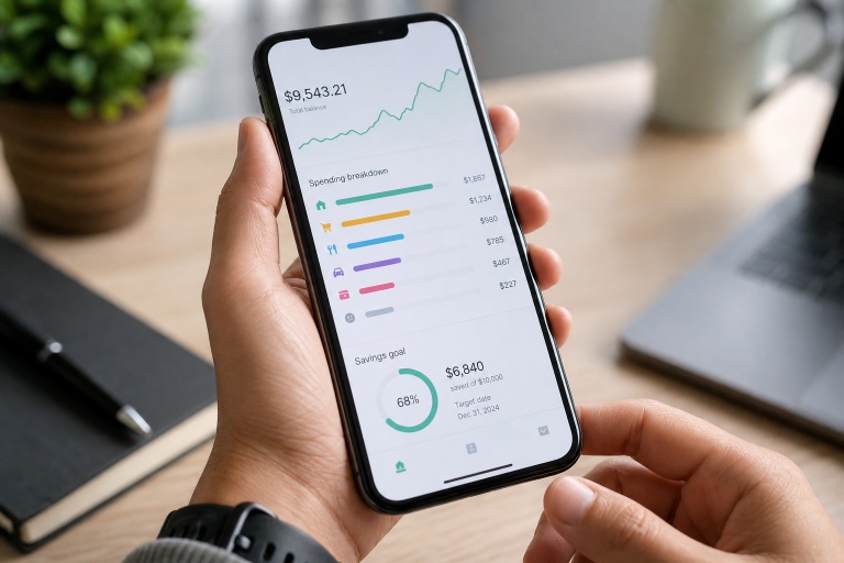
Each number should have a job. Available cash shows what remains after near-term bills, but it should not be confused with the full checking account balance. Monthly income and expenses provide a cash-flow snapshot, while upcoming bills help prevent surprises. Spending by category can reveal habits or unusual increases, and savings progress connects everyday choices with larger goals.
- Available cash: Supports near-term spending decisions.
- Income and expenses: Shows whether the monthly cash flow is positive or tight.
- Upcoming bills: Helps users prepare for recurring payments.
- Category spending: Makes changes in habits easier to spot.
- Savings and debt progress: Keeps long-term goals visible.
Build A Simple Information Hierarchy
The first view should answer the question, “Am I okay this month?” Put urgent information near the top, such as available cash, bills due soon, and a concise monthly spending summary. Use larger type for the few figures that matter most, then group supporting details into clear sections below.
Detailed transactions should be available without overwhelming the summary. Consistent labels, date ranges, spacing, and number formats prevent users from mistaking a yearly total for a monthly amount or a pending charge for a cleared payment.
Use Charts That Explain, Not Distract
Choose visuals based on the question being asked. Line charts work well for changes over time. Bar charts make category or month-to-month comparisons easier. Progress indicators fit savings goals and budget limits, while a simple list or table-style card is often best when exact dollar amounts matter.
Effective dashboards use visual tools to interpret information from separate sources without making users decode clutter. The University of Maryland explains how data visualization tools can support clearer analysis across disparate data sources, a useful principle for personal finance design as well. Test every chart with a real task: a user should be able to identify an increase in spending without studying a crowded legend.
Make Trends Easy To Read
- Show the current figure first.
- Add a useful comparison, such as last month or the recent three-month average.
- Explain whether the change needs attention, is neutral, or represents progress.
- Let the user inspect the transactions behind the number.
Use plain labels such as “up from last month” and “three bills due soon.” Do not rely on green, yellow, or red alone. Include text, icons, and clear dates so users can understand the status even when colors are difficult to distinguish.
Design For Different Financial Routines
A student with irregular income, a household sharing bills, and a freelancer separating business and personal purchases will not need the same default view. Let users hide unnecessary metrics, adjust categories, switch between weekly and monthly views, and manage shared access without unnecessarily exposing private information.
Protect Accuracy And Trust
An attractive design cannot compensate for unreliable data. Show when each account was last updated, distinguish pending transactions from cleared ones, and keep transfers from being counted as income or spending. Users should also be able to correct categories easily and receive confirmation before deleting records or changing important settings.
Improve Accessibility And Plain-Language Design
Use readable text, strong contrast, keyboard-friendly controls, and screen-reader labels for charts and status indicators. Replace specialist language with clearer terms. “Available cash” is easier to understand than “liquidity,” and an alert should explain both what happened and what the user can do next. The layout should remain useful on phones, tablets, and desktop screens.
A Practical Testing Process
- Write five user tasks, such as finding the next bill or checking a savings goal.
- Show users the first screen for five seconds and ask what they notice.
- Record where they misread totals, miss alerts, or open the wrong section.
- Reduce clutter, shorten labels, and improve the order of information.
- Test again with people who have different levels of financial confidence.
Common Mistakes To Avoid
- Showing too many charts on the first screen.
- Mixing monthly, annual, and lifetime figures without obvious labels.
- Using color as the only indication of risk or progress.
- Sending alerts for every small transaction or harmless change.
- Hiding important details behind vague menus.
- Ignoring manual corrections, unusual income, or shared-account needs.
Common Questions About Personal Finance Dashboards
What Should Appear First?
Start with information that supports immediate decisions: available cash, upcoming bills, current spending, and progress toward the user’s most important goal.
How Many Metrics Should A Dashboard Show?
There is no universal number. Keep the first view short and focused, then provide optional detail for users who need to investigate further.
Should A Dashboard Include Advice?
It can offer reminders and prompts, but advice should not hide the underlying numbers. Users need context to decide whether a suggestion fits their circumstances.
Final Checklist For A Useful Dashboard
- Does the first screen answer the most important money question?
- Can users spot meaningful changes quickly?
- Are the exact figures and supporting transactions easy to access?
- Are alerts helpful rather than noisy?
- Can users see when data was last updated?
- Does every major metric suggest a clear next step?
Conclusion
A useful personal finance dashboard does more than collect numbers. It helps users see what changed, why it matters, and what they can do next. Start with real decisions, select only useful metrics, organize them clearly, and earn trust through accurate data and understandable language. The result is a calmer, more practical tool for everyday financial choices.


